Database List
The charts on this page give aggregated and total information about the database and your usage.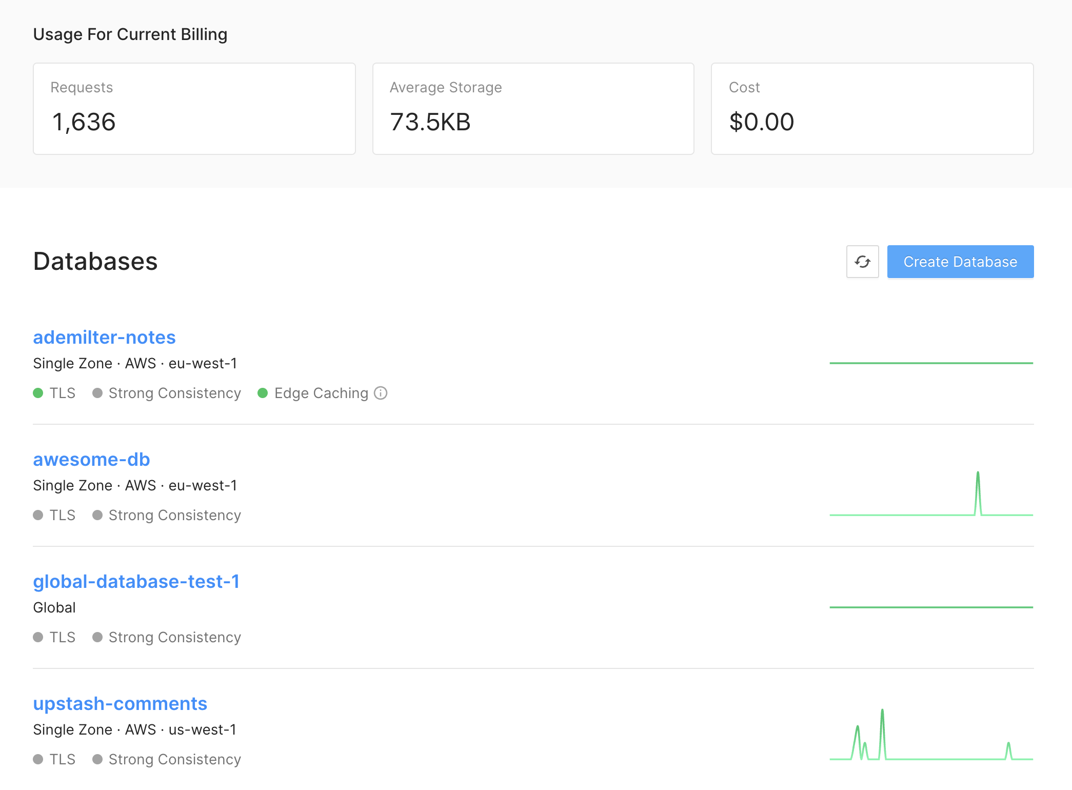
- The region of the database
- The current size of the data
- The current count of active connections: Not that if your connections are short-lived then you may see 0 here most of the time.
Database Detail
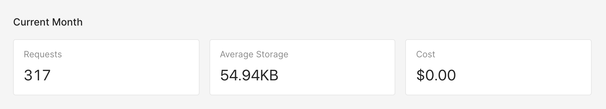
The charts on this page show metrics that are specific to the selected database.Current Month
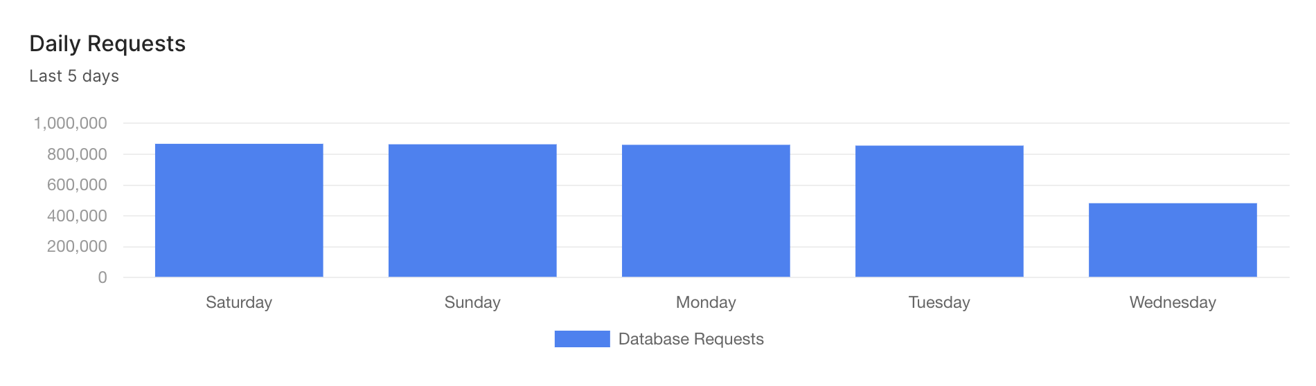
- This chart shows the daily cost of the database. The chart covers the last 5 days.
Daily Request
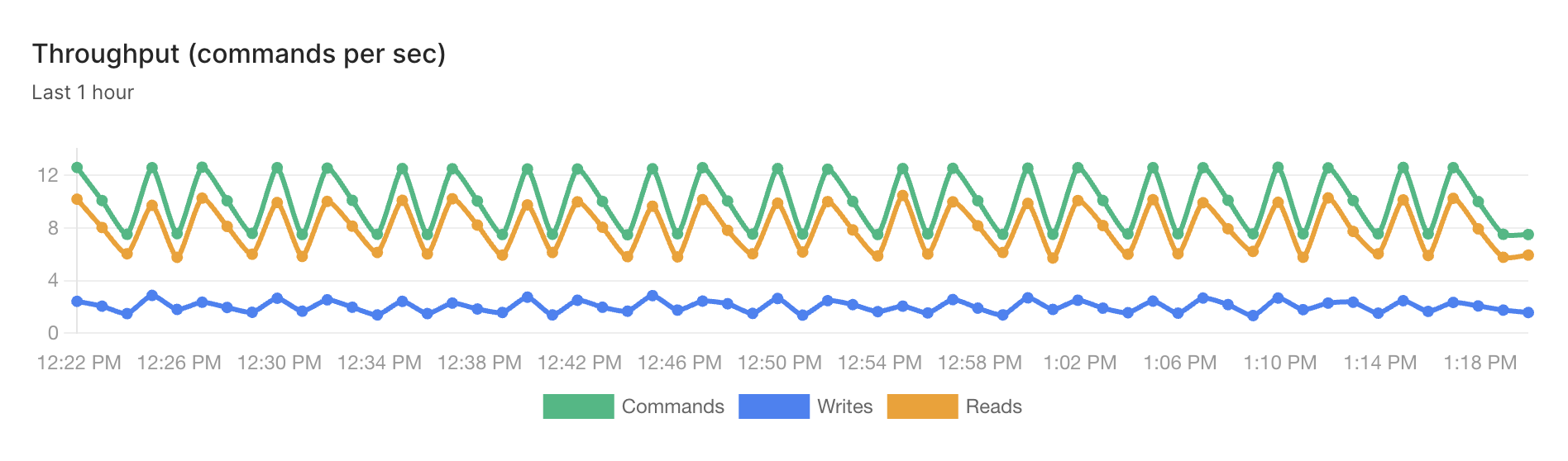
Throughput
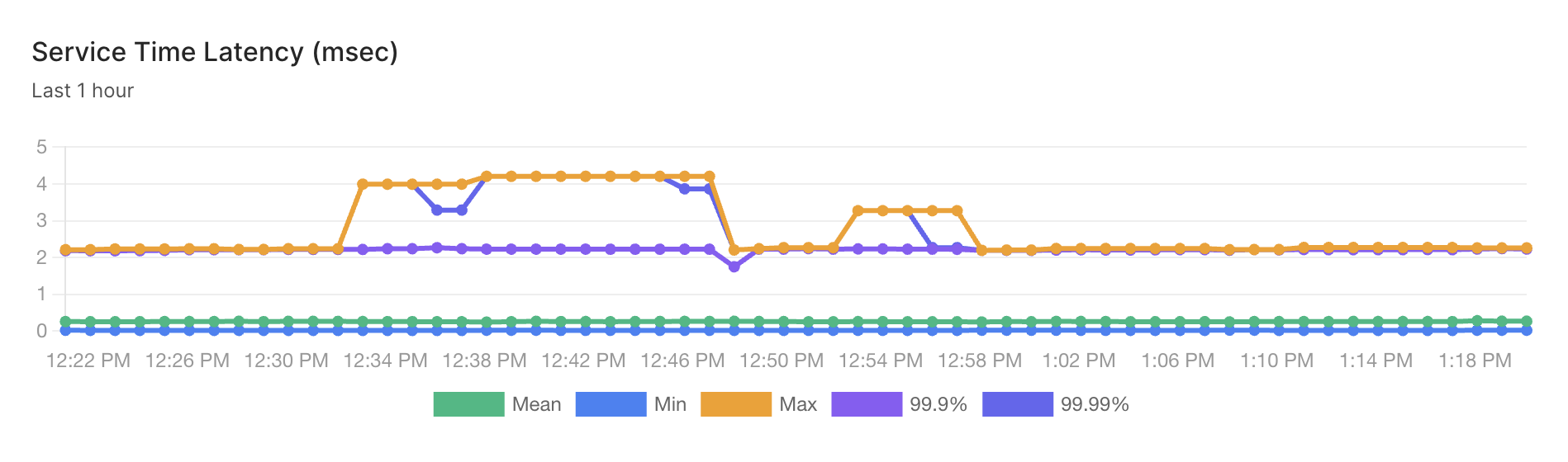
Service Time Latency
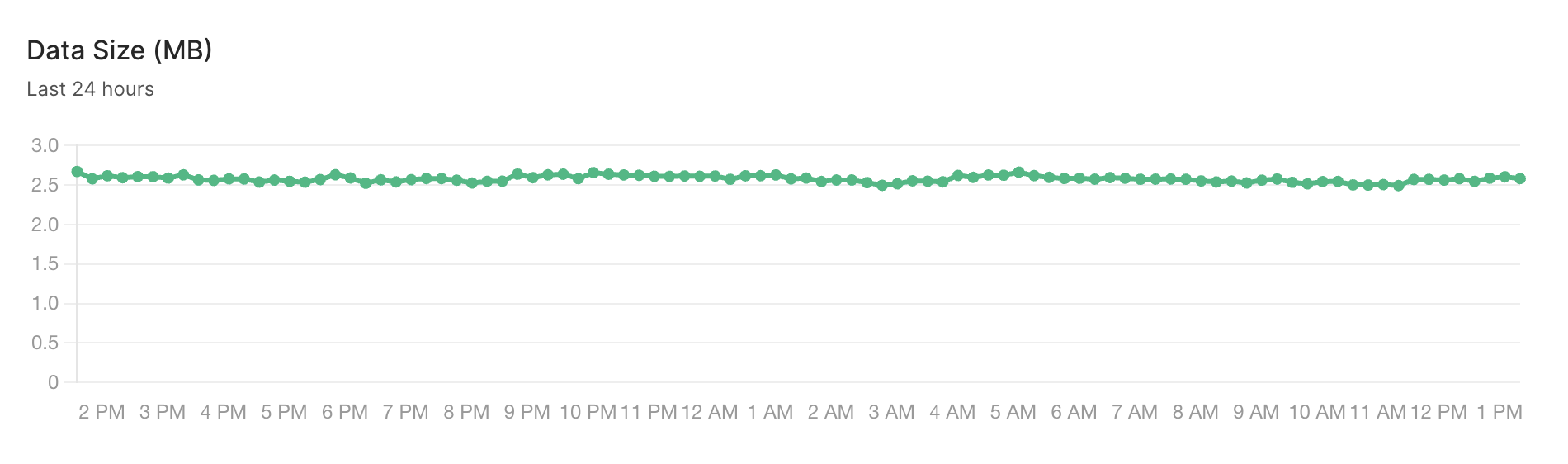
Data Size
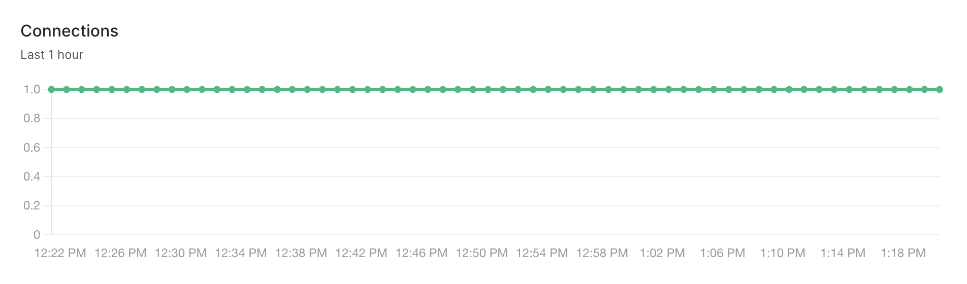
Connections
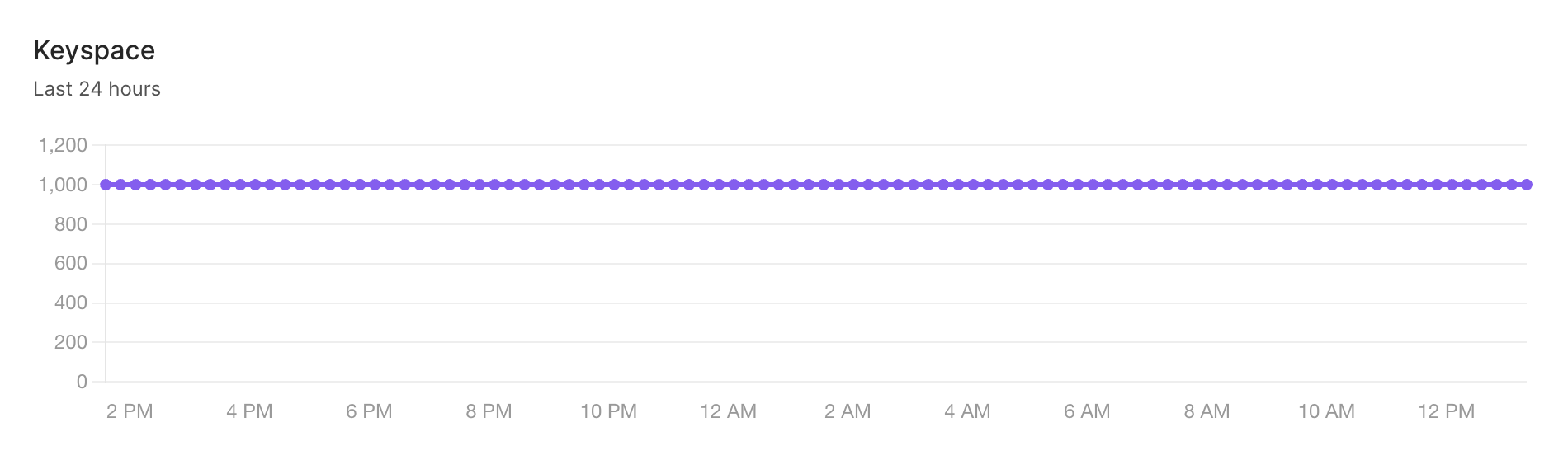
Key Space
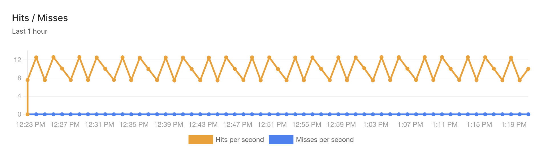
Hits / Misses